Your Product Isn't Too Complex. Your Story Might Be.
Why a compelling story begins with what your audience cares about, not what your product can do.
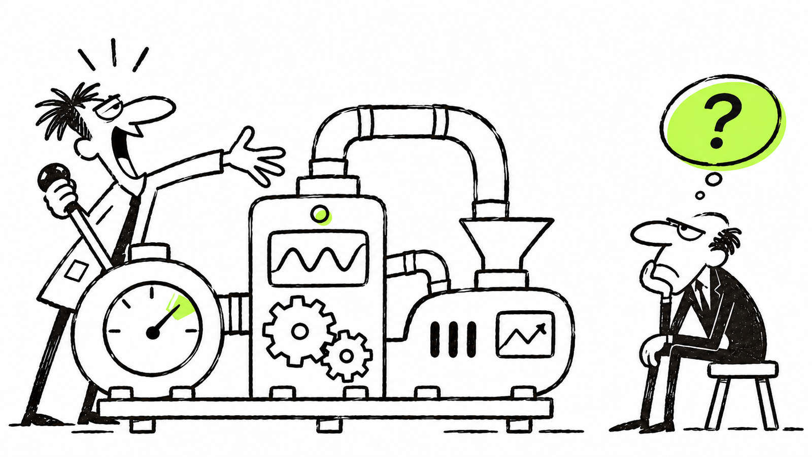
There's something that happens when you spend enough time building a product: its value starts to feel obvious.
You know how it works, why each feature exists, and what makes it different. You've probably spent months, maybe years, thinking about it. So when it's time to explain it to someone else, you assume they'll see what you see.
But they don't have your context. And that's where communication starts to break down.
I've seen companies spend a lot of energy describing their technology, their process, and everything they've built, while leaving one question unanswered: Why should I care?
The five-minute test
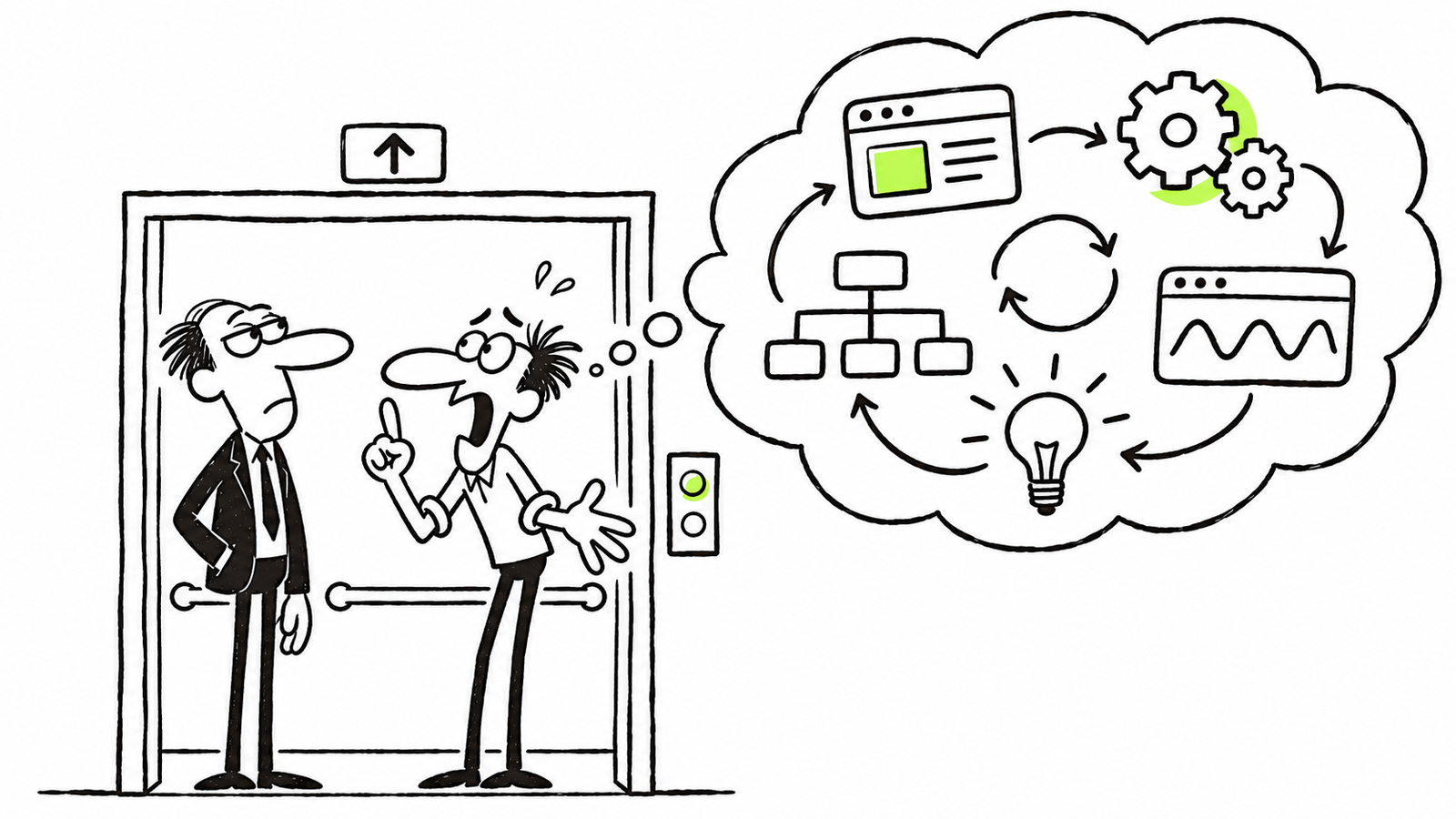
When I'm working with a client on a website's story, I like to ask a simple question:
Imagine you have five minutes to tell me about your company and convince me that what you're building matters. What would you say?
Sometimes I make it harder: you're sharing an elevator with someone, and you have thirty seconds to get their attention.
You can't walk them through every feature. You can't explain the entire technology. You have to make a choice about what's important.
And that constraint is useful. It forces you to look at your product from the other person's perspective, rather than your own.
Most people don't arrive at your website looking for a list of things you've built. They arrive with questions, frustrations, ambitions, or problems they're trying to solve. The story becomes interesting when they can recognize themselves in it.
The vitamin and the painkiller
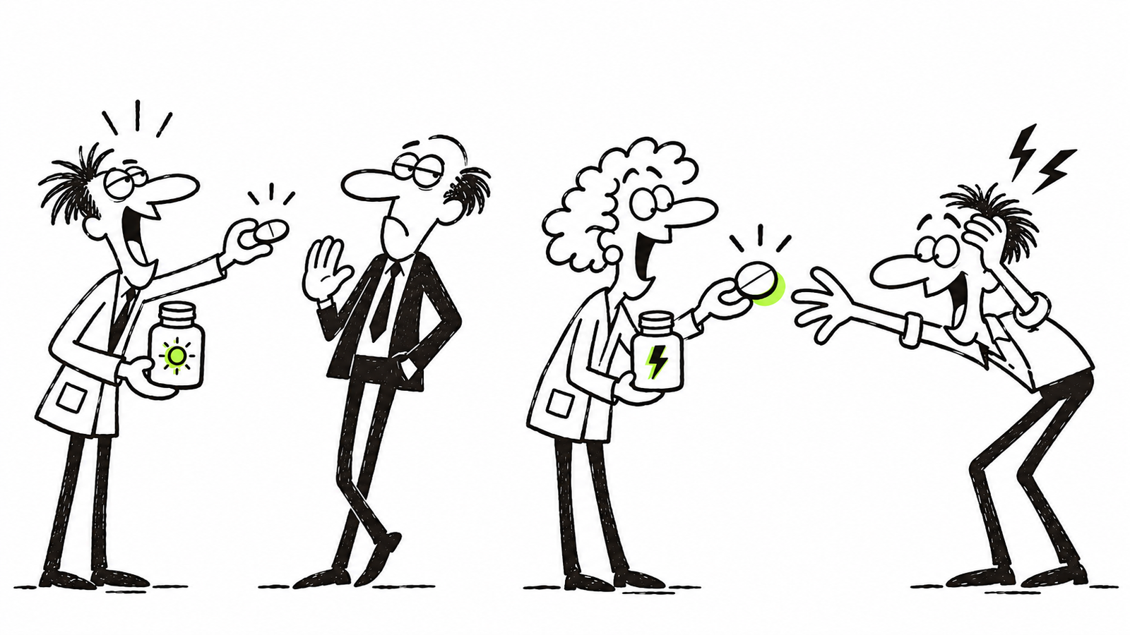
There's an old analogy in the startup world about vitamins and painkillers.
A vitamin promises a benefit. It might improve your life over time, but you don't necessarily feel an urgent need for it today.
An aspirin is different. You have a headache. You want relief. The value is immediately clear because the problem is already real to you.
I find this analogy especially useful when thinking about brand and website storytelling.
It's not that every product has to solve an emergency, or that you should manufacture a problem to make something sound important. It's about finding the genuine need behind what you offer.
If your story starts with what your company does, you're asking people to figure out why it matters. If it starts with a problem they already recognize, you've given them a reason to keep listening.
Start with a point of view, not a service list
One project that illustrates this well is Agile By Design, a consultancy challenging the way organizations approach agile.
Agile was supposed to help teams become more adaptive. But in many organizations, its implementation can end up feeling like another rigid set of rules, processes, and ceremonies. The human side of the work gets lost.
Agile By Design had a different point of view. Its opening message was simple:
“Agile is Broken. Let us fix it with you.”
It doesn't start by explaining a methodology or listing consulting services. It starts by naming a frustration that the right audience may already feel.
That's what makes the line compelling. It creates recognition before asking for attention.
For the brand and website, my role was to give that point of view a visual language. Broken graphic elements reinforced the opening statement. Hand-drawn gestures introduced a more human character. And the page's narrative moved from the limitations of conventional agile practices toward a different idea of agility.
The company's team developed the content and copy. My job was to help that story come through in the identity, design, and digital experience.
Rather than simply describing a different approach, the website could make that difference felt.
Agile By Design
Bringing a consultancy’s unconventional approach to life through branding and Webflow.
Sometimes the best explanation is something people can see
I explored a more literal version of the same principle in Therma Dynamics, a fictional concept for data-center cooling.
Instead of beginning with technical components and specifications, the experience opens with a data center under thermal stress. Heat builds. The problem becomes visible. Then the story introduces the cooling solution and shows the system returning to a stable state.
Even without knowing the engineering behind it, you understand what's at stake.
That's where visual storytelling, motion, and interaction can help. A sequence revealed through scroll, a visual metaphor, or a change in the environment can communicate an idea more directly than paragraphs of explanation.
Of course, the technical details still matter. They just don't always need to come first.
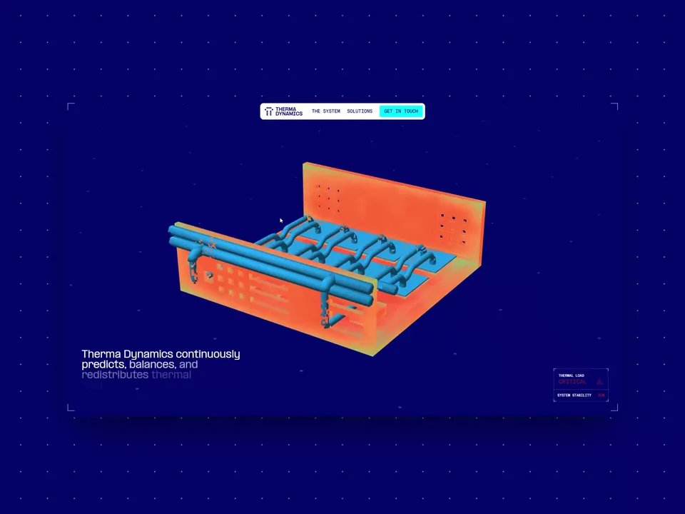
Therma Dynamics
Imagining a digital identity for the infrastructure behind AI.
Clarity isn't the absence of complexity
A good story doesn't make a sophisticated product less sophisticated. It makes the complexity easier to approach.
Once someone understands the problem, recognizes its relevance, and becomes interested in the solution, they're much more willing to explore the details.
That's the order I try to work toward: find the real problem, make people care, introduce a meaningful alternative, and then explain how it works.
Because the goal isn't to make people understand every part of your product in thirty seconds.
It's to make them want to understand more.
Building something that's hard to explain? Let's make your story matter.